Did you know…?
Today we’ll liven up this little while with curiosities about everyday brands that you may not have known… so the next time you come across something like this, you can make yourself interesting and demonstrate your general knowledge… but without going overboard, don’t become a smartass.
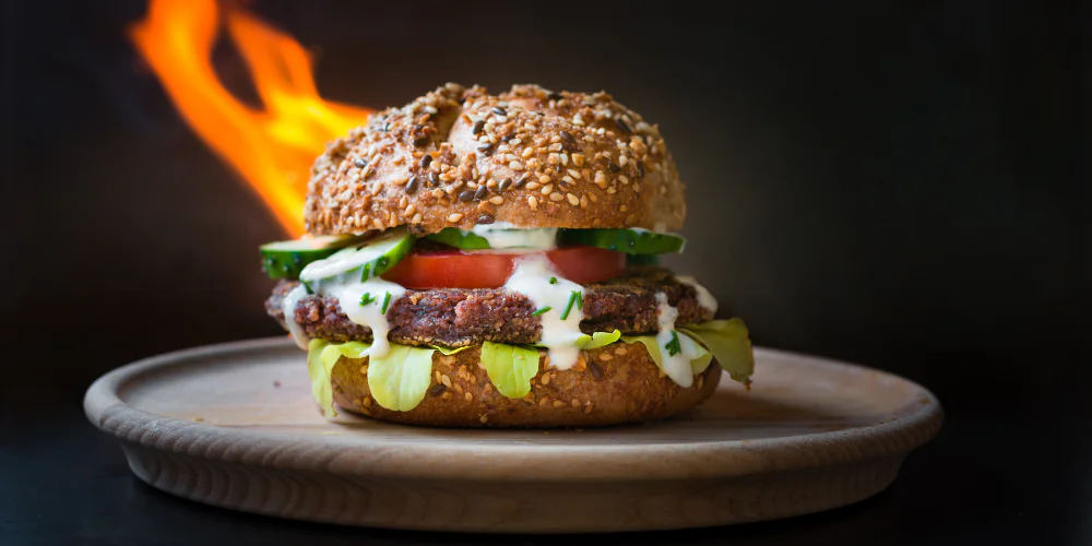
Did you know… on many occasions, tricks are used in advertising to make foods look better than they really are.
To make a food look like it is hot, they usually put a glass of boiling water behind it, so that the steam emanating from it looks like hot smoke. Or beer foam is actually soap. Melted cheese on pizzas is glue on glue… yuck, I don’t think I like the taste of the secret ingredient.
Did you know… the logo we know today for Chupa Chups was designed by Salvador Dalí in 1968. This logo only took the artist one hour of work, even though he was paid a millionaire’s fee.
The first advertising that included Dalí’s logo was accompanied by the slogan “És rodó i dura molt, Chupa Chups”, which translates from Catalan as “It’s round and lasts a long time, Chupa Chups”.
By the way, it never hurts to sweeten up your life: you feel like one.
Did you know… advertising in the 1970s began to include bright colors to attract the viewer’s attention and encourage product sales. Previously, advertising was in black and white, with brief images without color and large prices. The change began with the introduction of colors and catchy phrases or slogans.
Did you know… the real origin of prices ending in .9 or .99 has nothing to do with marketing techniques.
The origin actually goes back to the introduction of cash registers in commerce and how to prevent clerks from stealing. By not rounding up the prices, the employee had to open the cash register to hand over the change and therefore the movement was recorded; thus preventing them from keeping the money directly in their pockets.
Today this practice has become a good marketing tool that facilitates impulse sales.
Did you know… in advertisements selling watches, they mark a similar time,
Some say that in this way the hands draw a smile, bringing a positive perspective to the image. Others, a little more esoteric, say that it is a magic hour, the hour when a person is already awake and active.
However, the most widely accepted idea is that, by being arranged in this way, the hands allow the brand logo to remain visible (which is usually at the top of the watch face), allowing it to be framed and emphasized.
Did you know… Yahoo is an acronym for “Yet Another Hierarchical officious oracle” which translates to “another officious hierarchical oracle”. It all makes sense…
Did you know… Bacardi liqueur has a bat in the representative image of its logo because the sheds of the company’s first distillery were full of these flying mammals. In Cuba, the presence of bats means good luck, so they decided that including this animal in their brand was a good design. And they weren’t wrong, today Bacardi is one of the most recognized brands in Latin America.
Do you have any curious facts you would like to share with us?